Kavya runs a small interior design studio out of Jubilee Hills. Her website looks genuinely good — a designer friend built it two years ago, and the portfolio photography does her work justice. When a potential client mentioned they’d “checked her out online but went with someone else,” Kavya assumed it came down to price or availability.
It didn’t. It came down to nine seconds.
That’s how long her homepage took to load on a phone with an average connection. Most people don’t wait nine seconds. They leave somewhere around three, often without knowing exactly why they lost patience — they just move on to the next result.
We hear some version of Kavya’s story often. A website that looks fine to the eye but is quietly failing on the things that don’t show up unless you go looking. Here’s the audit we run on every client site, broken into the parts that actually matter.
Google measures three specific things about how your site feels to use, and in 2026 all three genuinely factor into ranking when pages are otherwise similar in quality. Largest Contentful Paint, or LCP, measures how long the biggest visible element takes to load — you want this under 2.5 seconds. Interaction to Next Paint, INP, measures how quickly your site responds when someone taps or clicks something — under 200 milliseconds is the target. Cumulative Layout Shift, CLS, measures how much your page jumps around while loading — buttons moving as images pop in, that kind of thing — and you want this under 0.1.
You can check all three for free through Google’s PageSpeed Insights in about a minute. Most business sites we test fail at least one of them, usually LCP, usually because of unoptimised images or a hosting plan that was fine for a five-page brochure site and isn’t fine anymore.
Every page should have a unique title tag and meta description that actually describes what’s on it — not the same generic line copied across twelve service pages. Headings should follow a logical order, one H1 per page, not a soup of bold text pretending to be headings.
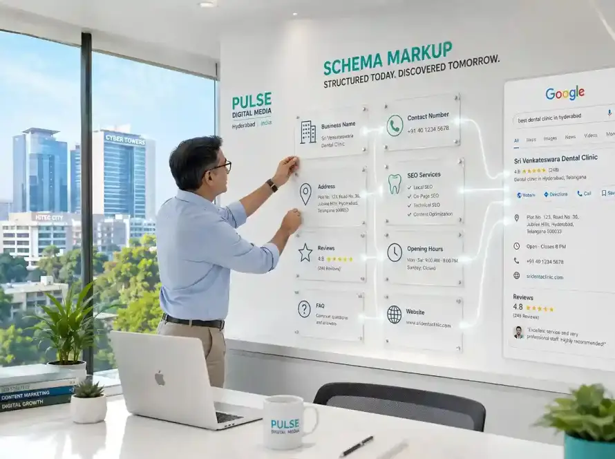
Schema markup is the structured data that helps Google, and increasingly AI search tools, understand exactly what your page is about. For a service business, that means LocalBusiness schema with your correct address and hours, and ideally FAQ schema on your key pages, answering the specific questions your customers actually ask before booking. This is a genuinely underused lever — most Hyderabad business websites we audit have none of it in place.
Mobile experience — where most sites fail first
More than half of the traffic to most local business sites now arrives on a phone. Check your site the way a customer actually would: on your own phone, on mobile data, not office wifi. Can you tap the call button without zooming in? Does the menu actually work? Does text run off the edge of the screen on any page? These sound basic, but we still find at least one broken mobile element on the majority of sites we review for the first time.
Conversion elements every page needs
A page that ranks well but doesn’t convert is a website doing half its job. Every important page needs one clear next action — call, book, enquire — stated plainly, not buried at the bottom after three paragraphs. Trust signals help too: real reviews, actual client photos rather than stock imagery, and clear contact information that doesn’t require a hunt through a hidden footer.
Kavya’s site, once we went through it properly, had a beautiful portfolio and almost nothing telling a visitor what to do next. No phone number above the fold. No enquiry form until you scrolled past the entire gallery. Gorgeous, and quietly useless at turning a visitor into a client.
The full checklist
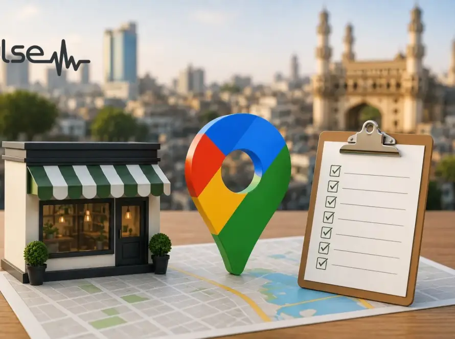
Run through this in order: check your Core Web Vitals scores, confirm mobile usability on an actual phone, verify unique titles and meta descriptions exist on every page, check whether schema markup is present, and make sure every page has one obvious next step for a visitor to take.
For Kavya, fixing the image compression that was dragging her load time down, adding a sticky call button for mobile visitors, and putting her enquiry form above the fold instead of after the gallery took about two weeks. Her load time dropped from nine seconds to just under three. She’s not tracking a huge lift in traffic — her rankings hadn’t really moved. What changed is how many of the people already finding her site actually got in touch.
That’s usually the real story with a website audit. It’s rarely about needing more visitors. It’s about not quietly losing the ones you already have.
If you’re not sure where your own site stands on any of this, get in touch for a free website audit — we’ll run through it and tell you exactly what’s costing you, in plain terms, no jargon.